Proven Everywhere
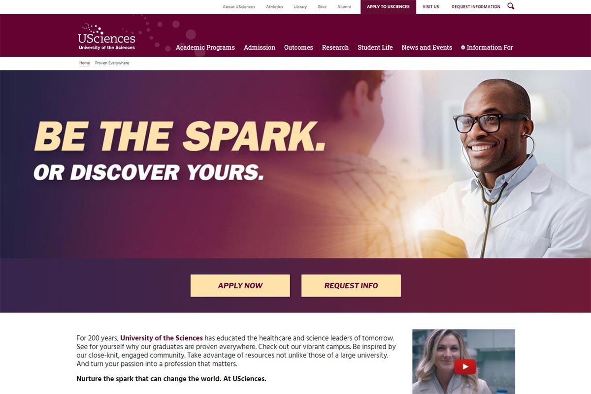
To help promote the university and its educational mission to prospective students, USciences maintains a continually updated brand landing page: Proven Everywhere. The webpage serves as a gateway for audiences interested in enrolling at USciences but also acts as a digital companion piece to the university's marketing presence on television, radio, streaming media, billboards, and physical mailings. Given this relationship, the design and messaging of Proven Everywhere is updated on a consistent basis in order to align it with the university's evolving marketing efforts.
Challenges
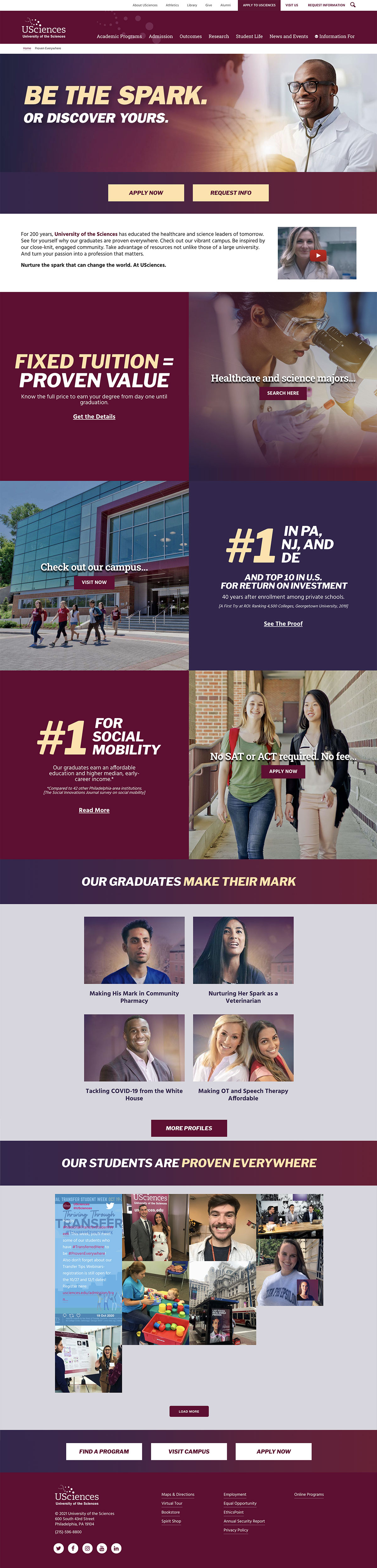
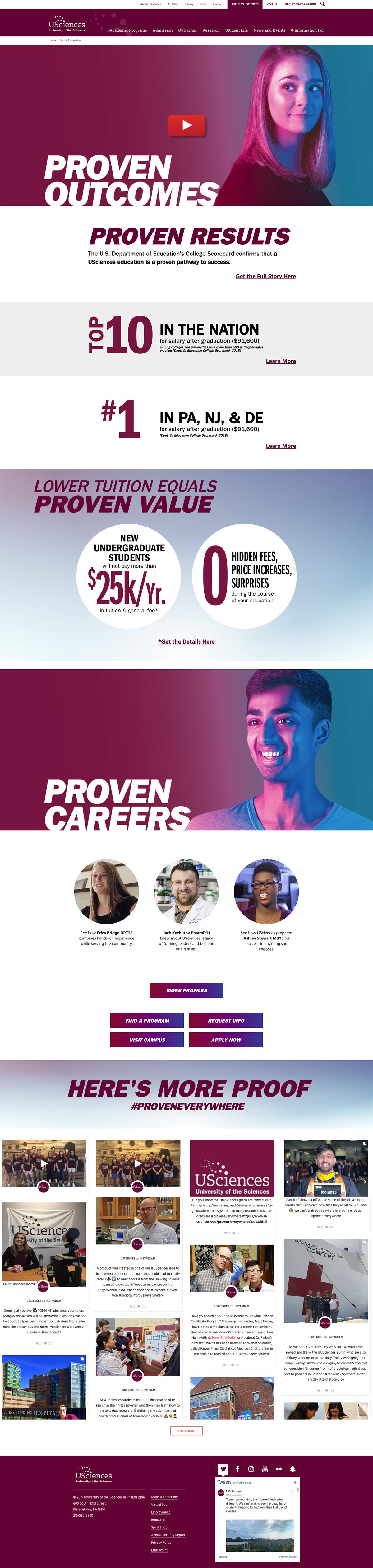
This landing page receives a complete design makeover on an annual basis, in line with the university’s bi-annual enrollment cycles. Though the purpose of the page does not change from year to year, the concept of the page and the information hierarchy does along with the look and feel. Being able to pivot to these new designs without having to reinvent the wheel each cycle is critical to delivering each landing page on time so as not to miss alignment with out-of-home, terrestrial, and digital advertising efforts.
Over 1/3rd of the web traffic these landing pages receive comes from mobile devices. The visual presentation of the landing page is heavily image-driven and visual assets reinforce key selling points on the page. Being able to deliver a responsive mobile experience to the user is essential to engaging with the on page content as well as enticing users to take their next step with applying or contacting the admission office.
Solutions
As the brand landing page has evolved from campaign cycle to campaign cycle so too have our strategies for delivering content and messaging.
- As a best practice, any region that can be generated using CSS instead of a graphic is generated using CSS. This includes designed text layouts, gradient backgrounds, calls to action, infographics, buttons, and more. My spearheading of this improvement accounted for the single biggest increase of on page performance.
- Mobile users are served different versions of banner graphics and other images on the page, pairing down filesize and narrowing dimensions (while accounting for mobile viewports) without sacrificing noticable quality.
- A/B testing our call to action placements helped improve visit and application conversions year over year.
Keeping users on our website increased conversion success, who would have thought?!
- For conversion actions such as “apply now” and “visit”, we have utilized different products to facilitate these requests campaign to campaign.
- Earlier versions of this landing pages sent users off site to fill out a form or start their application, actions which were not ideal for user engagement.
- Solutions that kept users on the landing page were advocated for and implemented as the conversion funnel allowed. The page now utlizes Lightbox modals for serving videos instead of sending users to YouTube.com, for example.

Visit Proven Everywhere